 ← Home
Summary
Uncommon Creative Studio Limited needed to improve clinical uptake of a product sales tool for a US healthcare client. As Senior Product Designer, I worked with the client's clinicians to help them understand product value while walking between hospital engagements. I reorganised critical information and designed a swipe-only navigation for one-handed access, removing the blocker to further product sales.
Problem
- A US healthcare brand sells infant formula. It markets to parents and to the healthcare professionals who recommend it. A field team of around 600 reps handles that second job, pitching to doctors across the country from an iPad.
- Pitches can last under a minute, caught in a hospital corridor between meetings. The doctors vary too. An OBGYN, a paediatrician, and others each need a version built for them, as does a product range that spans formula for infants, toddlers, and premature babies.
- The current tool runs 30 to 40 pages, with the content that could win a recommendation buried out of reach. It works against how reps move, since they prefer to swipe over click and worry about wasting a doctor's time. And it stays fixed, so it cannot shift to suit the doctor in the room. The company wants to grow sales in a fast market, and the experience holds them back.
What I did
Investigated existing interaction cost
The biggest cost was the tapping. Reps tapped to open reference notes, tapped to switch product, and tapped again to move between pages. The science that backed each claim sat behind more taps still, so most of it never reached the doctor. Every tap pulled a rep's eyes down from the conversation.
Rebuilt around swiping
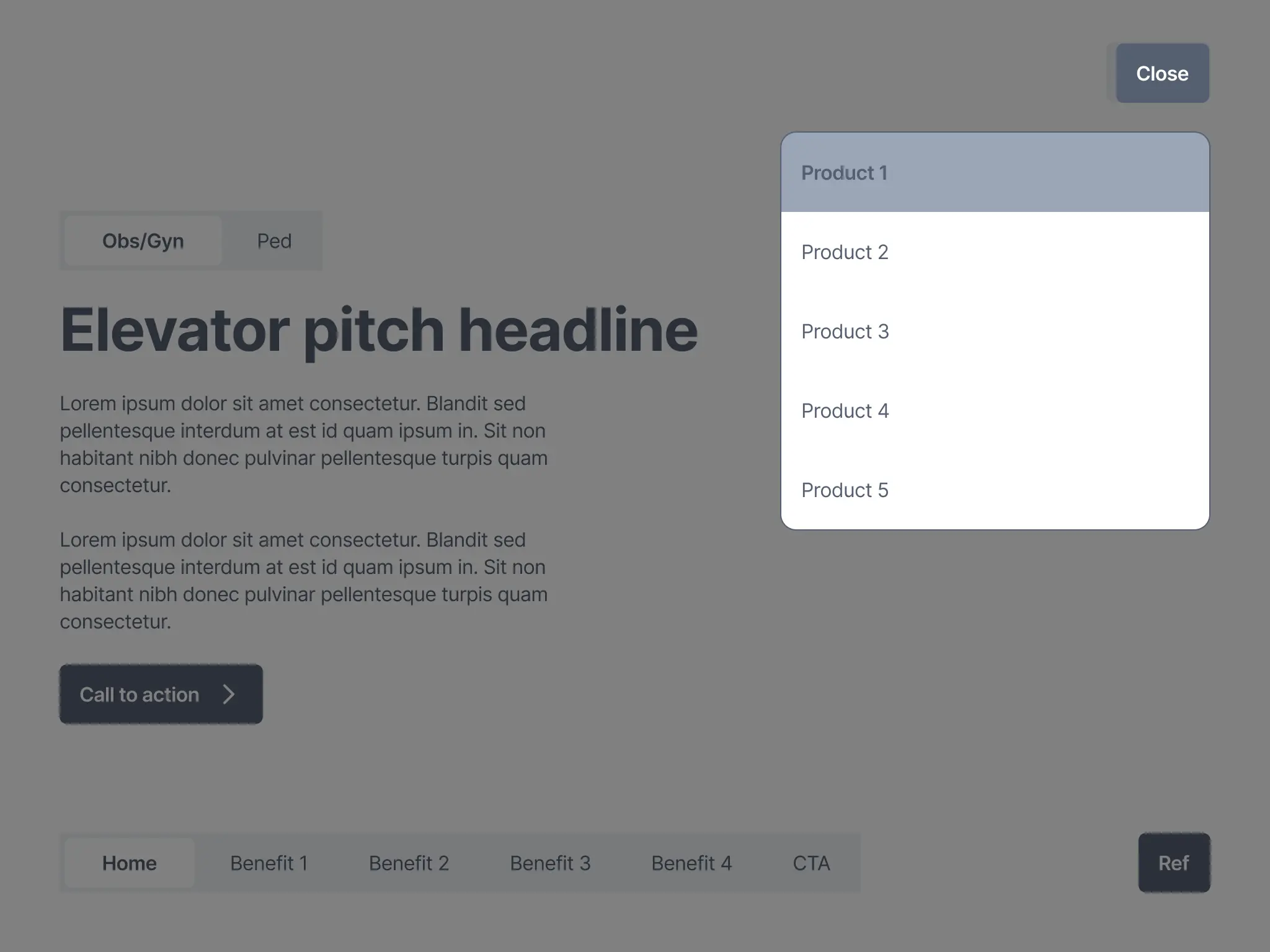
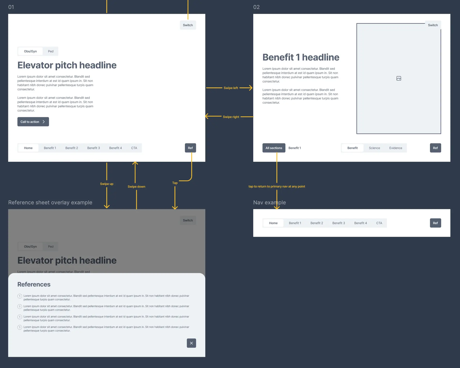
I rebuilt the experience around swiping. The pitch now runs sideways as one story: the opening, then each benefit in turn, then the call to action. A rep swipes left and right to move along it. To switch product, they swipe down and then choose from a short list - the interaction cost is justified as they don't switch often. To bring up references, they swipe up, and a sheet rises from the foot of the screen. A toggle at the start of each product journey sets the type of doctor in one tap, so an OBGYN and a paediatrician each open into a version built for them.

Maximised content visibility
- I surfaced all the content that was hidden in the existing tool so that reps and doctors could easily see where they were in the product journey at all times. This is key for sales reps that are constantly switching context between relaying the content, asking questions and switching to new doctors as and when required.
- I achieved this with a dual navigation system - a top tab strip that shows where the rep is in the journey, and a lower strip that describes the layers inside the current place, for example a product benefit.
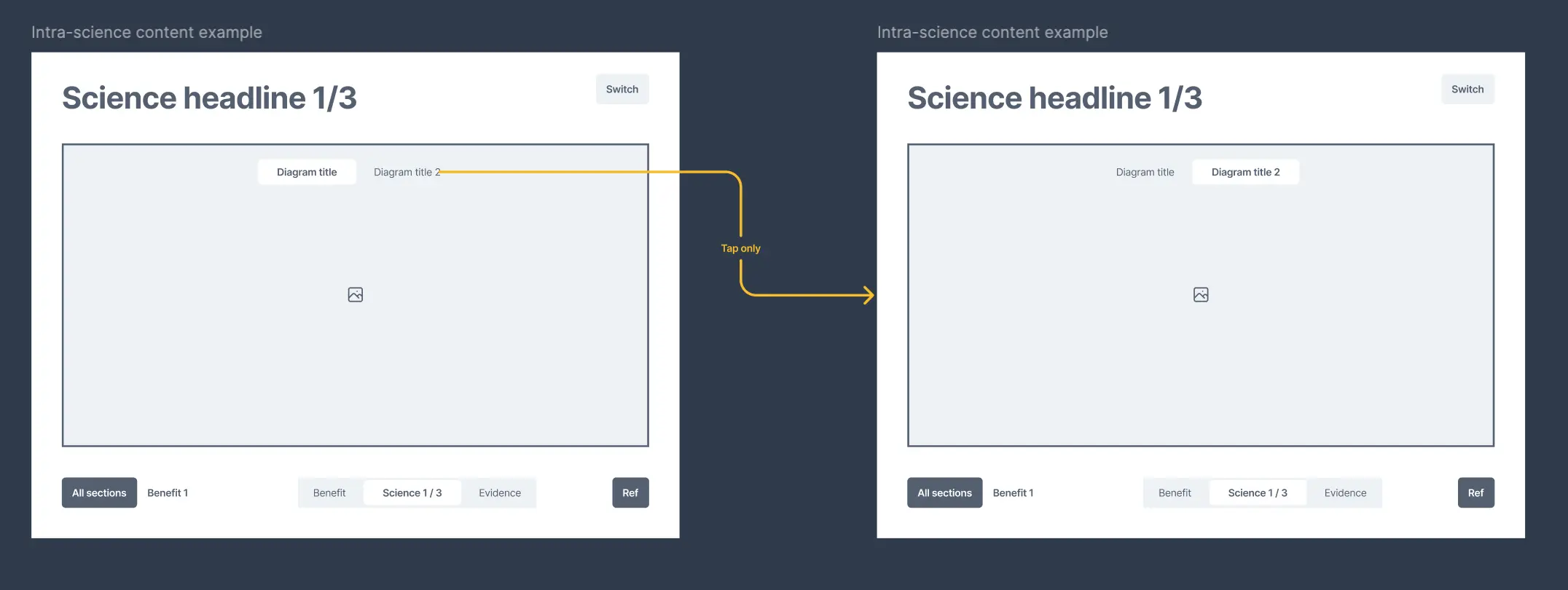
- Where a benefit held more science than one screen could show, a counter such as "Science 1 of 3" told the rep how much was left.
Increased tab switcher touch targets
The client incorporated the wireframes into their regular testing cycle with internal reps. Initial results were positive with report that navigation was much easier. However, 3/5 reps felt that they would sometimes miss the OBGYN and pediatrician switcher when trying to change before an engagement. I increased the size of the tab switcher in the wireframe accordingly.
Added share functionality
To help reduce any potential missed oportunities in addition to the re-architecture, I added one more move at the evidence layer. A rep can send a study straight to the doctor, so the pitch leaves something behind after the meeting ends.
Results
As my engagement with Uncommon Creative Studio Limited was fixed for the duration of another project, I didn't develop the redesign beyond wireframes. However, I understand the following initial results since launch in May.
- 3/5 staff felt the navigation was much easier
- Product uptake among clinicians rose from 20% to 50%
